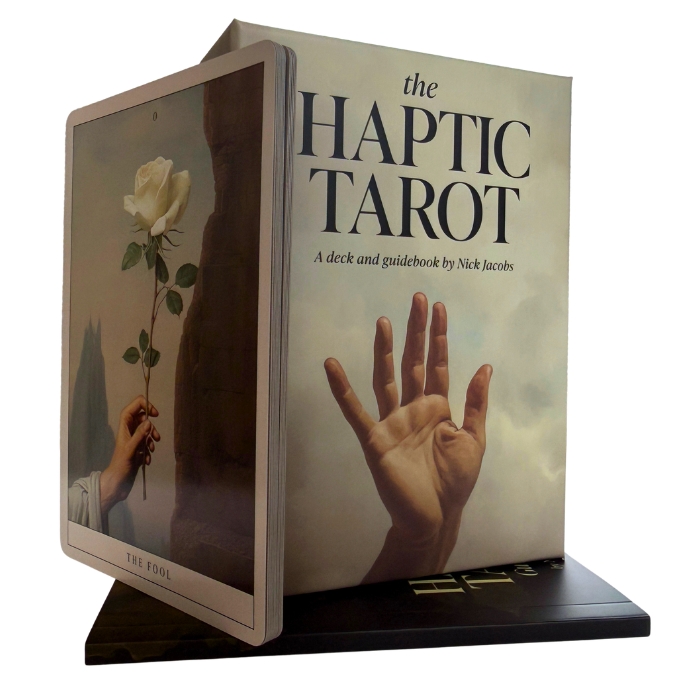
The Haptic Tarot - hands as symbol, Van Eyck as reference
Most tarot decks distribute meaning across a full scene: figures, landscapes, objects, expressions. The Haptic Tarot narrows that field to hands. Every card places a hand, or hands, at the centre of the composition, asking the reader to sit with gesture before reaching for interpretation.
Nick Jacobs, a San Francisco-based tarot reader, mentor, writer, and designer with over twenty years working with the cards, created this 79-card deck with a background in design and art history. His visual reference is Jan van Eyck, the early Flemish painter whose fifteenth-century oil technique brought a new kind of realism to European painting. The imagery was developed through a generative AI process that Jacobs guided himself, writing the prompts and curating the output. The result is atmospheric and deliberately slow: dark backgrounds, muted earth tones, close compositions that feel more like candlelit interiors than open tableaux.
What the cards look like
The palette is restrained: deep shadows, warm ochres, occasional cool greys. Where a classic Rider-Waite-Smith card fills the frame with narrative, The Haptic Tarot holds back. A hand grips a cup. Fingers rest on a sword hilt. The scene is implied rather than shown. That compression gives the deck an introspective, slightly unsettling quality that several readers have described as haunting. The deck includes a bonus card called The Reader, and a 60-page guidebook offering three keywords per card and three spreads for more extended work.
Who this deck suits
This is not a starter deck. The structure follows Smith-Waite conventions, but the imagery strips away enough of the familiar storytelling that readers without a grounding in those meanings will find little to anchor on. For someone who already knows the cards and wants a deck that rewards slower, more tactile engagement, it is a considered choice. The card size, 95 x 125 mm, is compact enough to handle comfortably without losing the detail in the imagery.
The Haptic Tarot tends to work best when you pause at the hand before you name the card - the gesture often carries more than the title does.
About the creator
Nick Jacobs has been reading and studying tarot for more than twenty years. He holds a background in design and art history and runs Page of Cups Tarot Readings, his own tarot practice in San Francisco. His approach to the guidebook reflects his work as a mentor: the text is concise, focused on reflection rather than rule-giving.
Specifications
- Author: Nick Jacobs
- Publisher: U.S. Games Systems, Inc.
- ISBN: 9781646713066
- Number of cards: 79 (including bonus card The Reader)
- Guidebook: 60 pages, English
- Card dimensions: 95 x 125 mm
- Box dimensions: 98 x 135 mm
- Language: English
Questions we often get
Is this a good deck for someone new to tarot?
The deck follows the Smith-Waite structure, but the imagery departs significantly from the familiar scenes most beginners rely on to learn meanings. Without that visual scaffolding, the cards offer less to anchor interpretation. A more illustrated, scene-driven deck would be a more practical starting point for someone new to the cards.
How were the card images made?
Nick Jacobs used a generative AI process, writing the prompts himself and curating the resulting images. The stylistic reference throughout is the work of Jan van Eyck, the early Flemish painter. The images are not reproductions of existing paintings but original compositions created in that visual spirit.