Retro Impression Tarot - Art Nouveau illustration on the RWS system
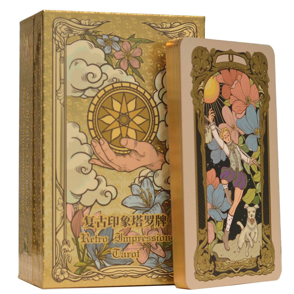
Art Nouveau had a short run, but its visual language is hard to mistake: sinuous lines, botanical ornament, organic forms that guide the eye through a composition. The Retro Impression Tarot builds directly on that tradition. Illustrator Yao Li drew every card in that style, with a colour palette that reads like a printed magazine or poster from around 1900.
At the same time, the Rider-Waite-Smith system remains intact. The familiar figures, scenes and symbols are all there, set within a decorative, almost architectural frame. That balance is not easy to get right. The Art Nouveau ornament has to enrich the card without obscuring what it means. For the most part, it does.
What you see on the cards
Yao Li did not apply an Art Nouveau filter to existing RWS images. The compositions are rebuilt from the ground up, with linework and ornamentation as structural elements. Patterns repeat from card to card, which means a spread holds together visually, like a series of posters from the same hand.
Card titles are in English, 'The Moon', 'Knight of Pentacles' and so on. The colour palette is warm and vintage in feel, not faded but tempered, as if a light sepia layer sits over a vivid original. Reviewers frequently mention the spot UV finish as something that does not photograph well: subtle gloss on a matte background, catching specific details in the image and giving them presence.
The production
This is edition 2.0, and it contains 80 cards. Alongside the 78 standard tarot cards there is an alternate version of the Hermit and an additional card called 'Happiness'. The paper is 350 gsm CAIDIE coated stock. Cards carry embossing, spot UV and gold foil stamping. The edges are finished with glossy gold gilding.
The box is a hinged flip-top with a shoulder insert, decorated with UV embossing and gold foil. The guidebook covers both English and Chinese, with notes on the two extra cards. The card size is 70 x 120 mm, which is a standard tarot format.
Reading the line direction
Anyone attentive to composition can use the ornamental lines in a spread as an additional layer of reading. The direction the lines run, and where they point from one card to the next, can reflect connections between positions that the card meanings alone do not always surface.
In a multi-card spread, follow the direction of the ornamental lines from one card to the next. The flow they trace sometimes maps the underlying connections within a reading.
The creators
The tarot cards are the result of a team effort: Ling Zhong, Chuan Zeng, Sha 'Lisa' Li, Li Yao, A-Fei and Hei. The illustrations are by Yao Li. The deck is part of the Vermilion Collection.
Specifications
- Number of cards: 80 (78 standard tarot cards + alternate Hermit + Happiness card)
- Edition: Standard 2.0
- Card size: 70 x 120 mm
- Paper: 350 gsm CAIDIE coated paper
- Finish: Embossing, spot UV, gold foil stamping, glossy gold gilded edges
- Packaging: Hinged flip-top box with shoulder, UV embossing and gold foil
- Guidebook: In English and Chinese, including explanation of the extra cards
- System: Rider-Waite-Smith
- Language on cards: English
- Illustrator: Yao Li
- Creators: Ling Zhong, Chuan Zeng, Sha 'Lisa' Li, Li Yao, A-Fei and Hei
- Publisher: Vermilion Collection
Questions we often get
What changed between the first edition and edition 2.0?
The first edition was slightly narrower at 66 x 120 mm. Edition 2.0 uses the standard 70 x 120 mm size, which makes the cards easier to handle and consistent with most other tarot cards in that format.
What language is the guidebook in?
The guidebook is in English and Chinese. It includes explanations of the two additional cards, the alternate Hermit and the Happiness card.